Yension Wrist Rest
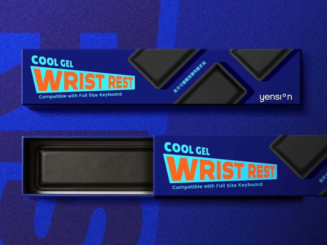
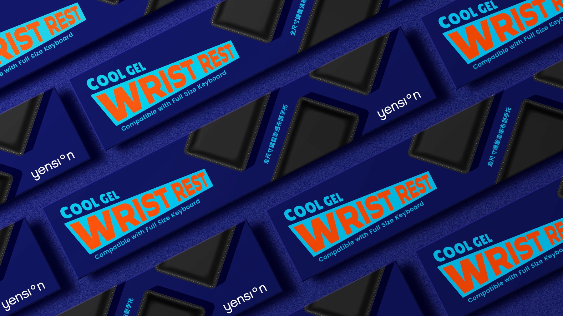
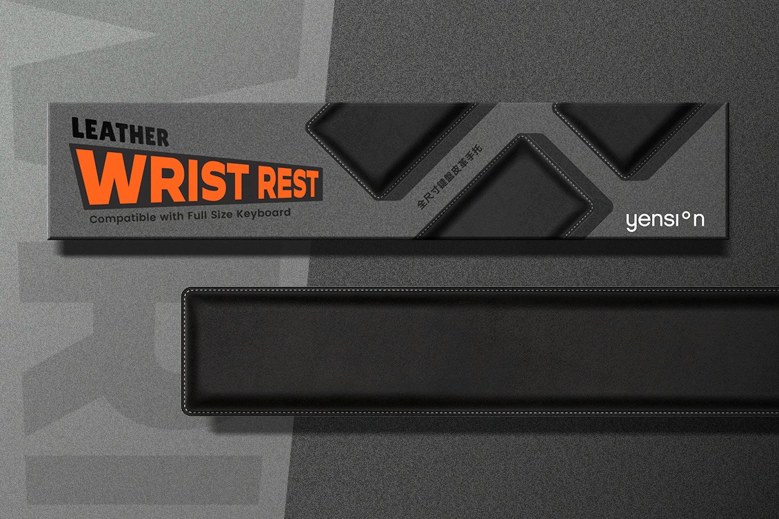
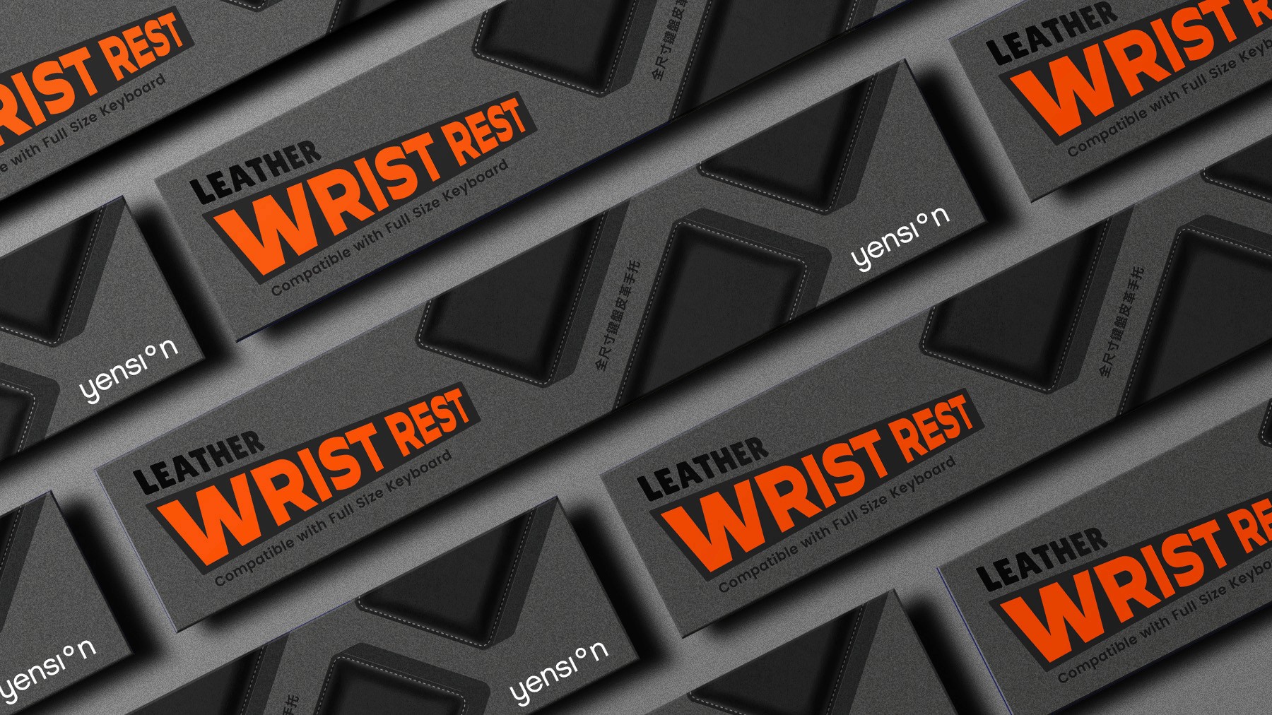
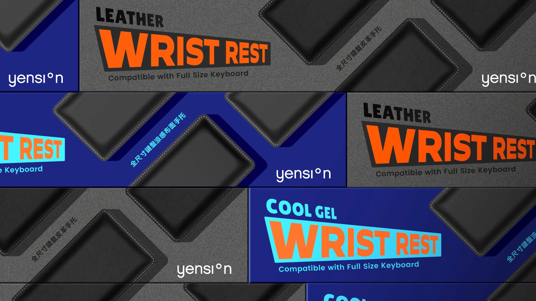
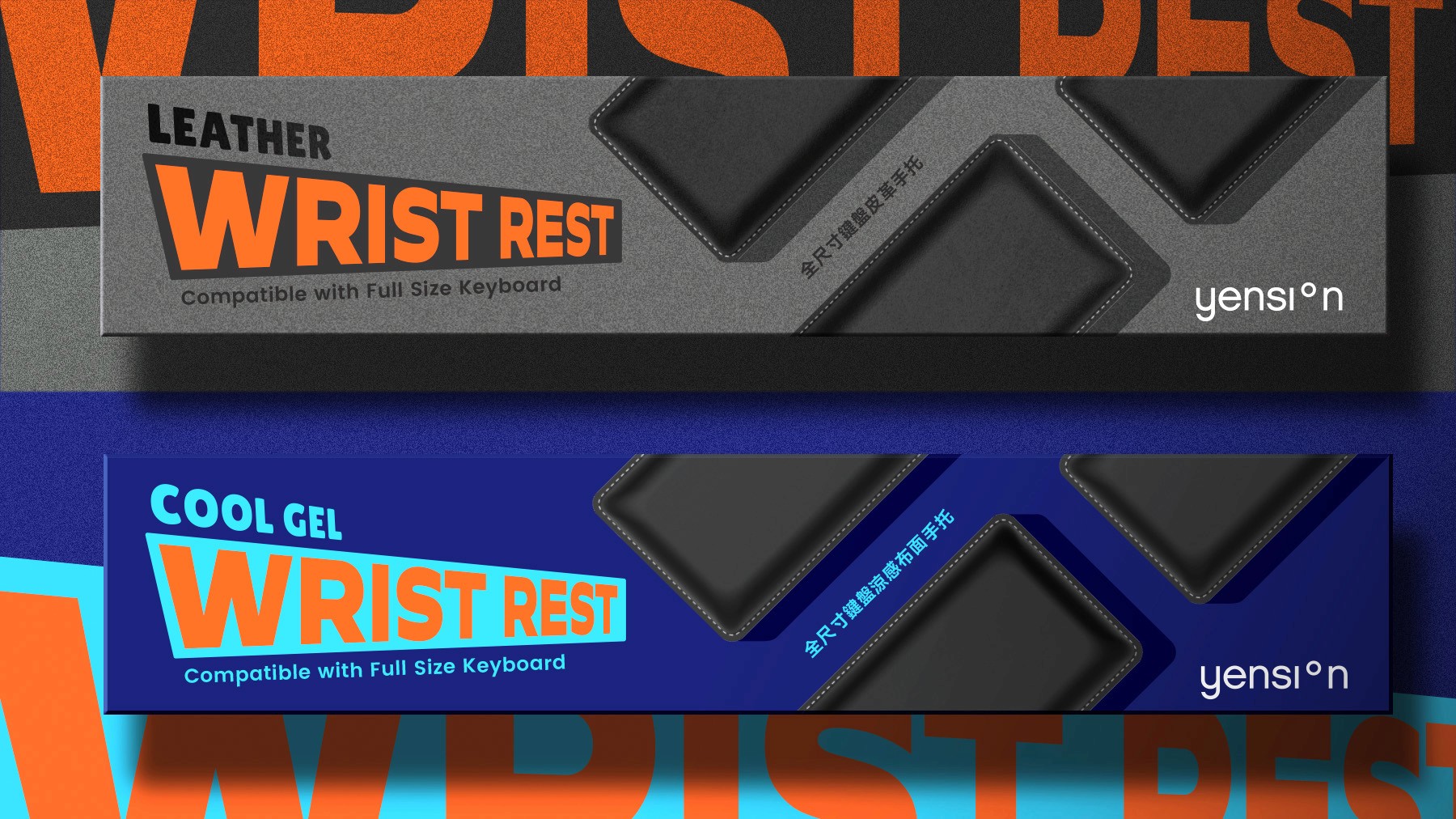
The primary challenge of this packaging is to stand out among larger, more established brands while maintaining clear and intuitive product communication. The design therefore focuses on creating a bold and highly visible visual presence that captures attention immediately. To achieve this, the product name is intentionally presented within a dynamic, “shouting” graphic frame. This device uses strong contrast and vibrant color to amplify visibility and create a sense of urgency that draws the viewer’s eye. At the same time, the product image is prominently displayed to ensure instant recognition and quickly communicate the function of the item. Together, these elements create a packaging system that is both visually compelling and easy to navigate, allowing consumers to immediately identify the product while reinforcing a confident and energetic brand presence. 此包裝設計的核心挑戰在於:在眾多體量更大、品牌更成熟的競爭者中脫穎而出,同時保持產品資訊傳達的清晰與直觀。因此,設計重點在於打造一個大膽且高可見度的視覺呈現,在第一時間吸引消費者的注意力。 為此,產品名稱被刻意置於一個具有動感、彷彿「在呼喊」的圖形框架之中。這一視覺裝置透過強烈的對比與鮮明的色彩來提升可見度,並營造出能迅速抓住視線的視覺張力。同時,產品圖像被清晰地呈現,以確保消費者能夠瞬間辨識產品,並快速理解其功能屬性。 這些元素共同構建出一套兼具視覺衝擊力與良好可讀性的包裝系統,讓消費者能在第一時間識別產品,同時強化品牌自信且充滿活力的形象。
Client
Yension
Design
PACKAGING
Year
2026
Role
Design concept & execution