DK Yogurt
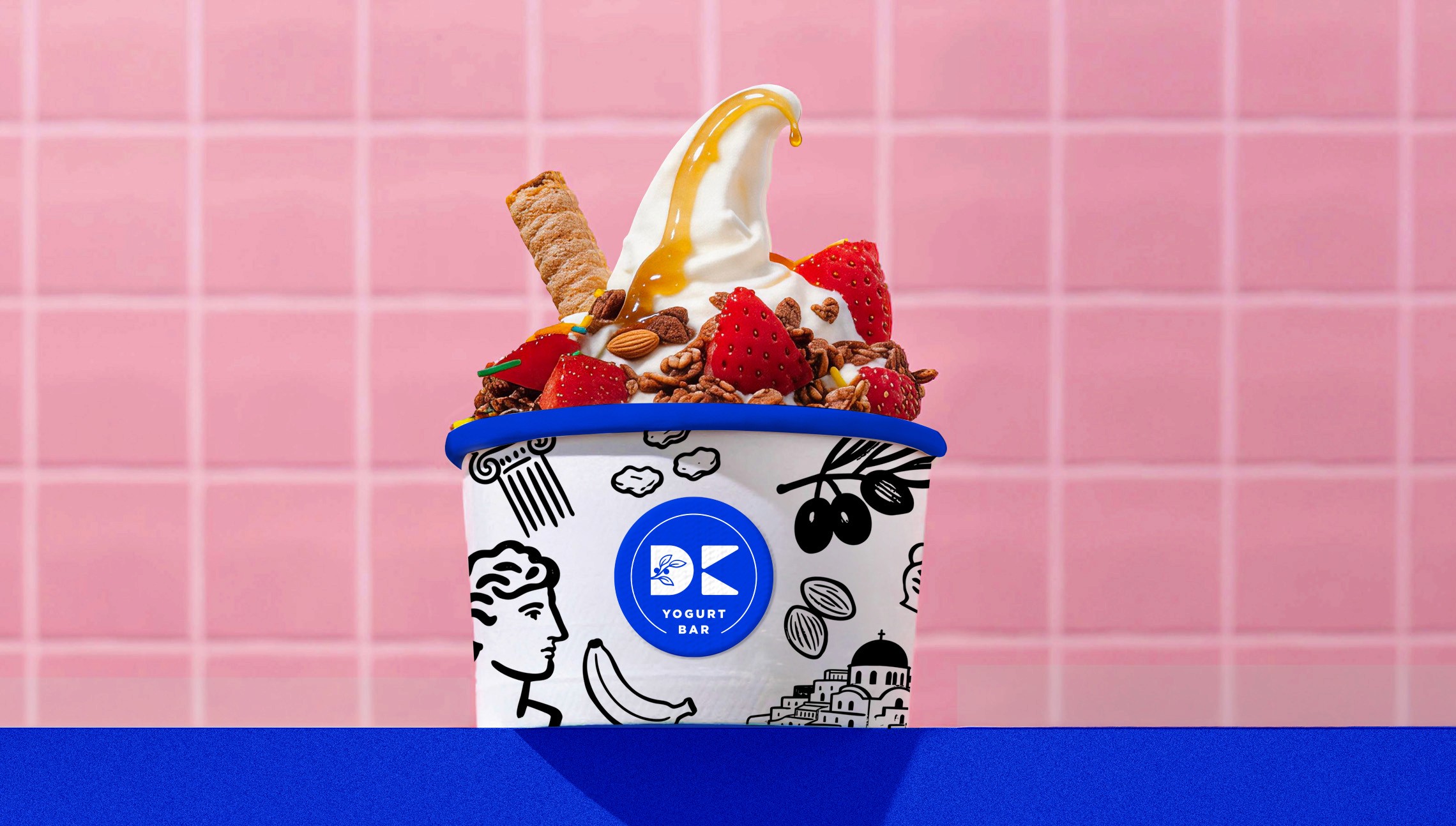
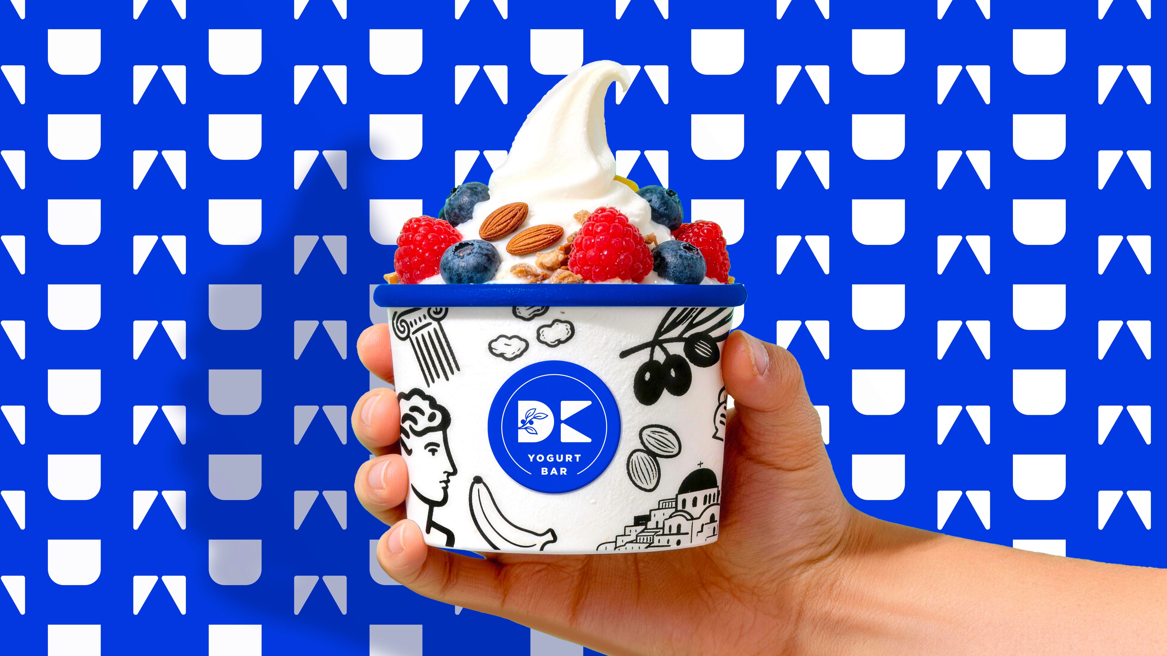
DK Yogurt is built around a clear and simple idea: authentic Greek yogurt, experienced in a fresh and joyful way. The design approach is rooted in a balance of purity and vibrancy, using clean structures paired with a sense of visual rhythm to create a brand language that feels both light and distinctive. The overall expression is bright without being overwhelming, conveying youthfulness and an effortless sense of health. By blending Mediterranean authenticity with a modern, playful energy, the design maintains a feeling of quality and honesty while remaining approachable, engaging, and full of life. DK Yogurt 圍繞一個清晰而純粹的核心理念展開:將正宗的希臘酸奶,以清新且充滿愉悅感的方式呈現給消費者。設計上以「純淨 × 活力」為出發點,透過簡潔的結構與富有節奏感的視覺編排,建立一種既輕盈又具辨識度的品牌語言。整體視覺呈現鮮明有趣,傳遞年輕感與自然健康的氣質,同時在地中海式的純正與現代、富有趣味的表達之間取得平衡,讓品牌既保有真實與品質感,又具備親和力與當代活力。
Client
DK Yogurt
Design
BRANDING
Year
2025
Role
Design Direction / Execution